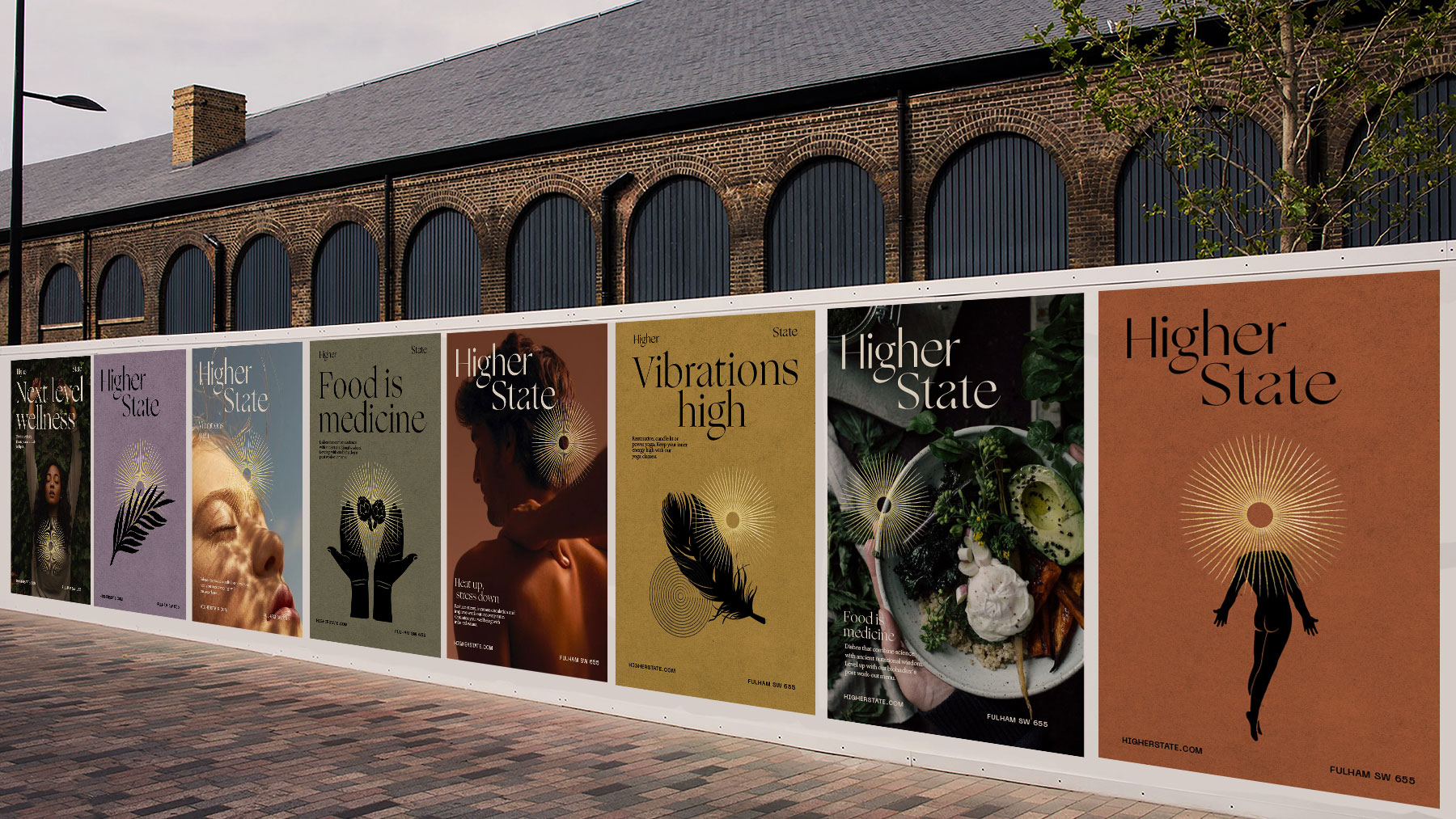
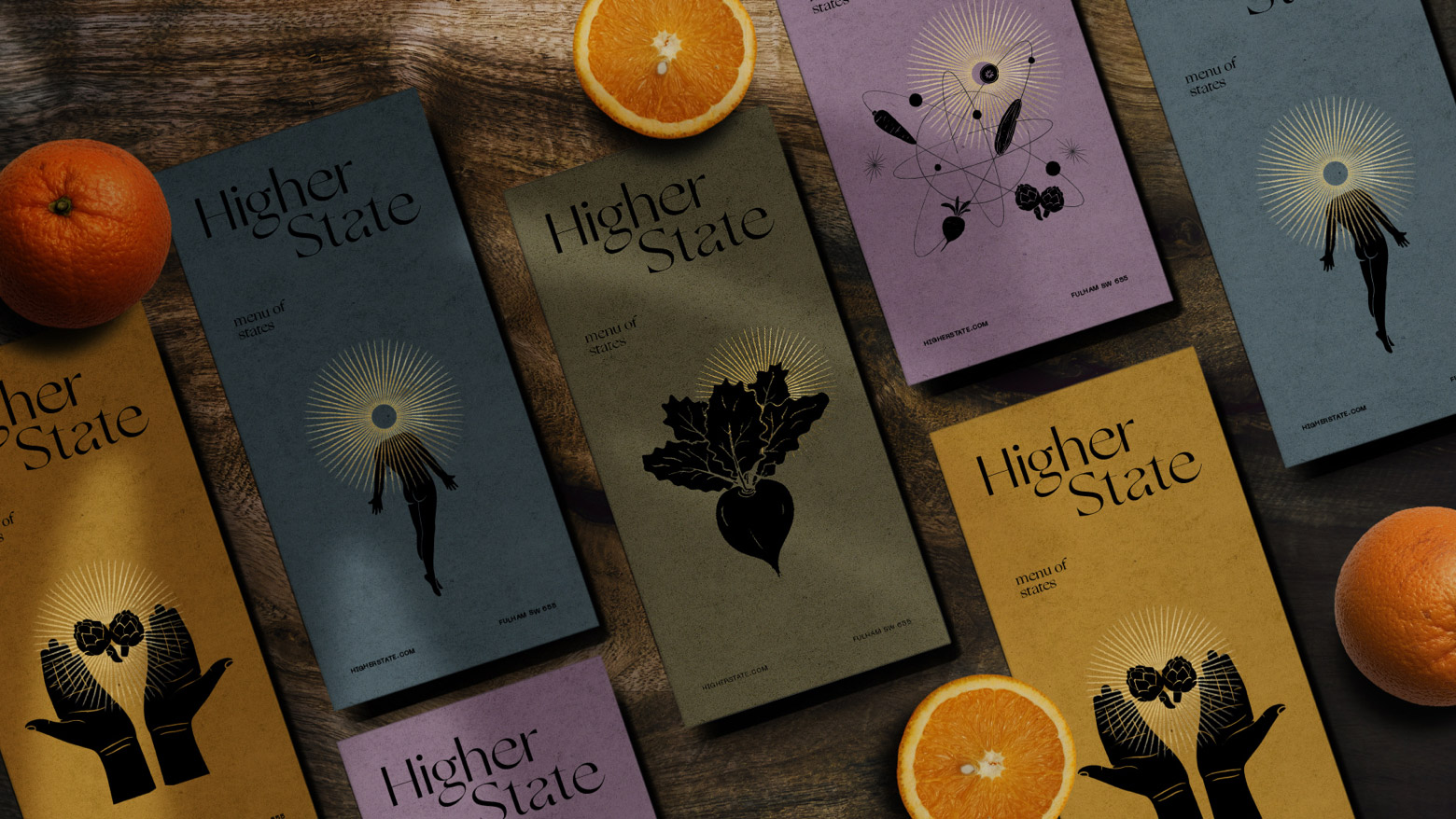
Customers reach their ‘Higher State’ by better connecting inside to themselves, and outside to nature. The brand identity celebrates this connection of inside and out.
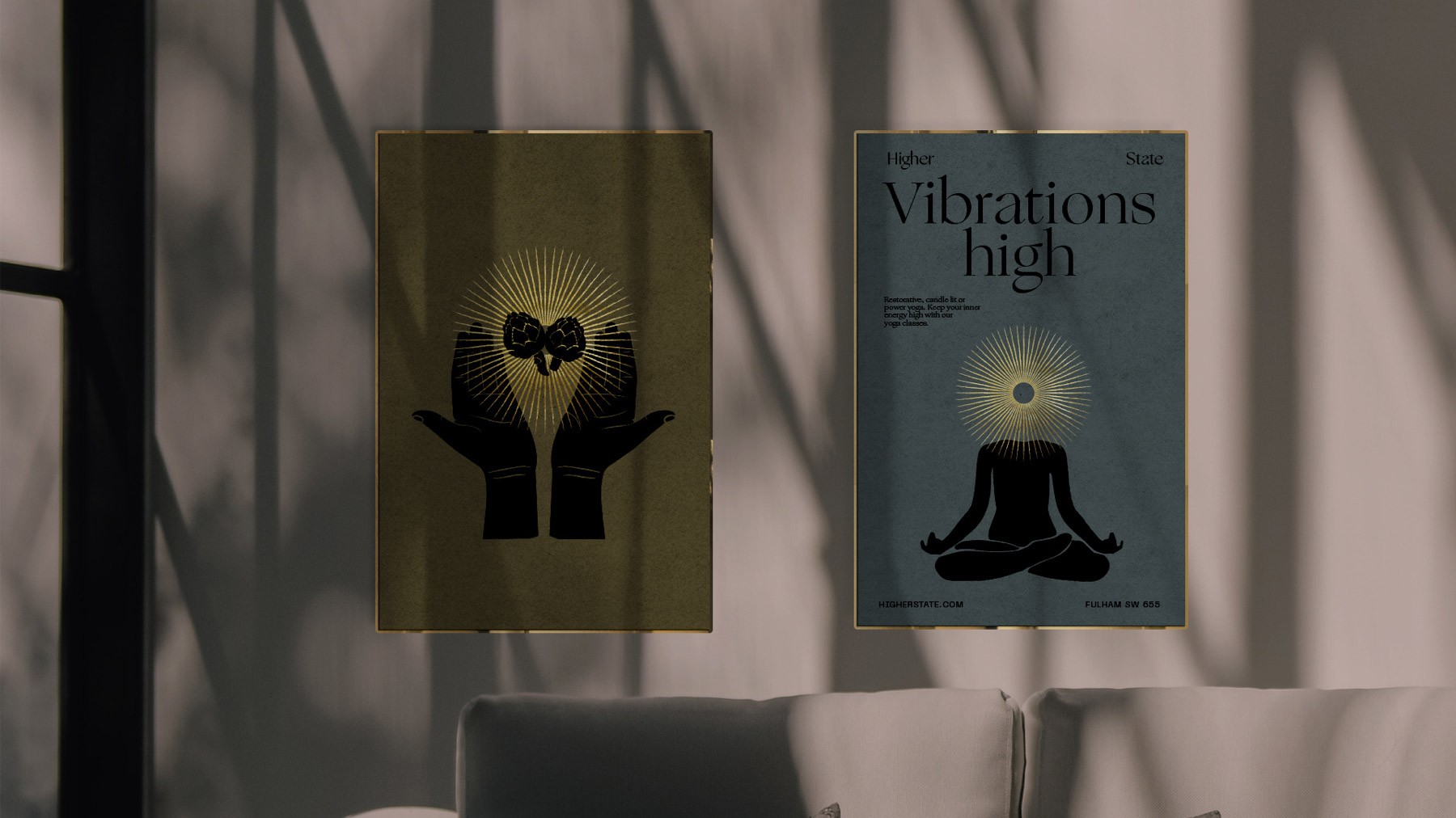
These centre on the gold ‘halo’ device, visually representing customers higher state. Bespoke illustrations create a new visual language for wellbeing.
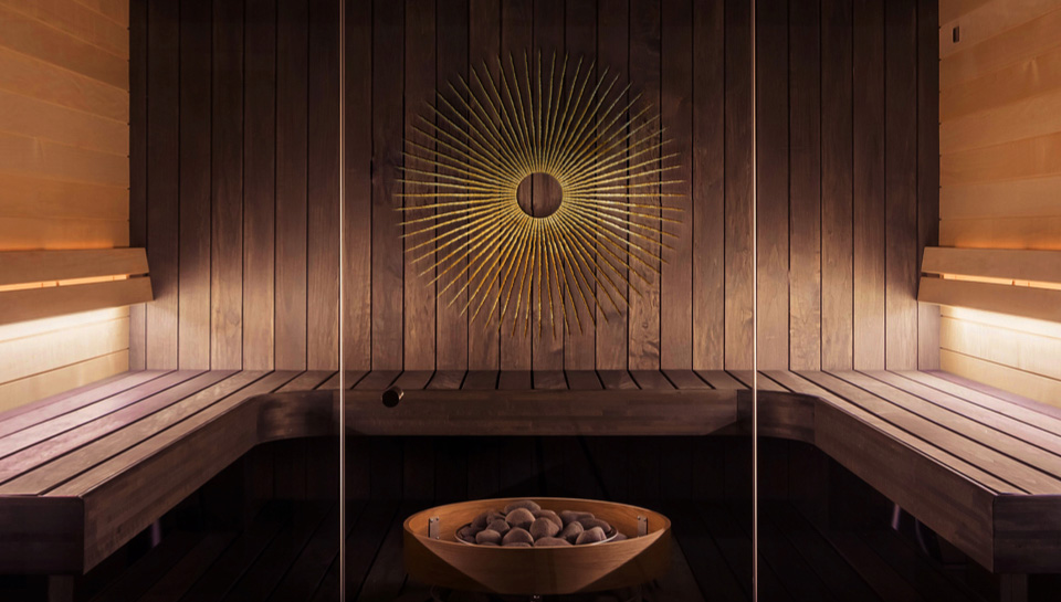
“We noticed most gyms are positioned at men, while plant-based cafés and yoga studios are usually positioned at women. We were resolute Higher State would be gender-neutral. Putting tired stereotypes to bed and expanding audience appeal.”
FOUNDER
MANIFESTO STUDIOS

Sustainable packaging for the bio hacking café.
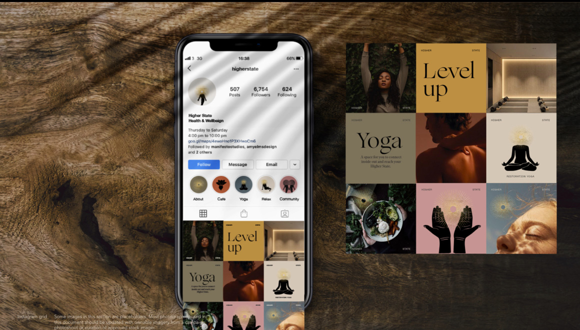
Instagram was a main way customers would discover the brand. We created a wide range of assets and templates to drive awareness.
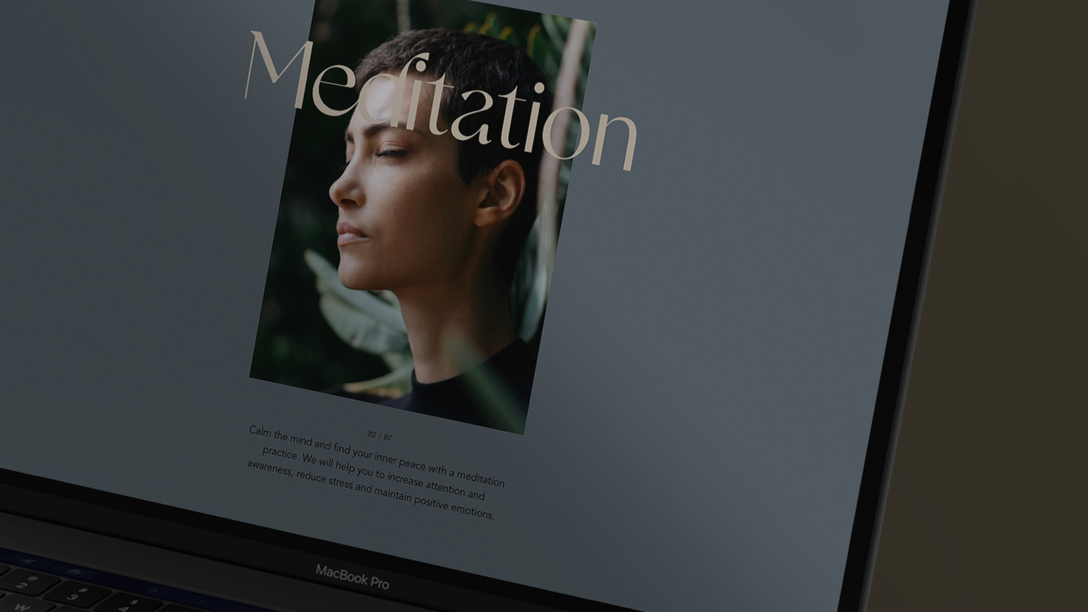
The website User Experience focuses on what makes Higher State special — the range and interlinking of their services.

The website uses natural sound frequencies which neuroscience has shown to help people relax into more optimum brainwave frequencies. The brand experience should always do everything it can to support the mission.

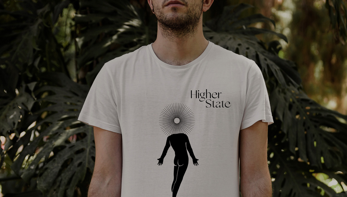
The brand identity led beautifully into merchandise. Supporting the community building aspect of the strategy.
We’re delighted to have won a prestigious Design Week Award for the Brand Strategy.
“Higher State Founder, Adam, had a creative background so it was great to build a process that allowed more collaboration in the design stages.”


